Menu Items Management
This feature allows an administrator to manage the application's dynamic navigation menu. It provides a central view to create, edit, reorder, and delete menu items, as well as to control their visibility through role-based security constraints.
Menu Items Listing
When entering the view, a tree grid is displayed showing all the menu items currently configured in the system.
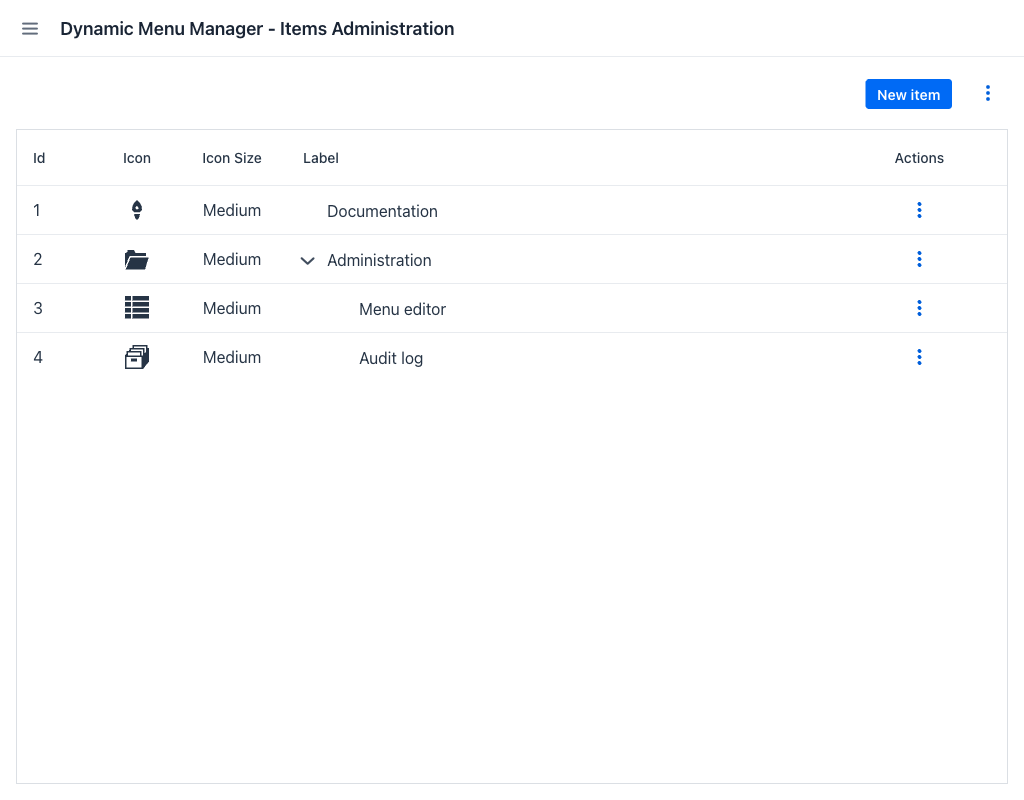
Grid Columns
The grid displays the following columns for each menu item:
- Id: The numerical identifier of the item.
- Icon: A visual preview of the icon assigned to the item, if any.
- Icon Size: The size at which the icon is rendered in the menu. Items that follow the application-wide default show that default rather than an explicit value, and items without an icon leave the column empty.
- Label: The display text of the item as it will appear in the menu. Items with children can be expanded to reveal nested entries.
- Actions: A contextual menu with per-item operations. See Item Actions.
All columns can be resized by dragging their edges.
The grid supports a hierarchical structure: items can be nested under parent items, forming a multi-level menu tree. Expand the tree by clicking the expand arrow next to a parent item's label.
When no menu items exist, the grid is replaced by a No menu items found message and the Export action is hidden.
Drag and Drop Reordering
Items can be reordered directly in the grid by dragging a row to a new position. Dropping an item on top of another item makes it a child of that item. Dropping it above or below reorders it among its siblings.
Note
Two moves are rejected: an item with an external URL cannot become a parent of other items, and an item cannot be moved inside one of its own descendants. In both cases the move is refused and an explanatory message is shown.
Top-Level Actions
In the top-right area of the view, two controls are available:
- New item (button): Opens the item creation dialog.
- ⋮ (actions menu): Opens a dropdown with global operations. See Global Actions.
Global Actions
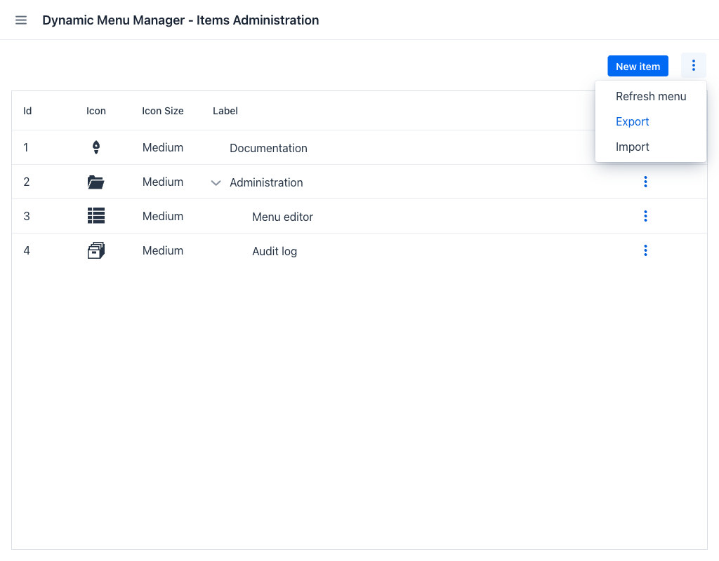
Clicking the ⋮ button next to New item opens a menu with the following options:
- Refresh menu: Reloads the current page to reflect any changes made externally.
- Export: Downloads the full menu structure as a JSON file. The file can be used to back up the configuration or import it into another environment. A notification confirms the download, and reports the failure if the menu could not be exported.
- Import: Opens the import dialog to restore or merge a menu configuration from a JSON file.
Item Actions
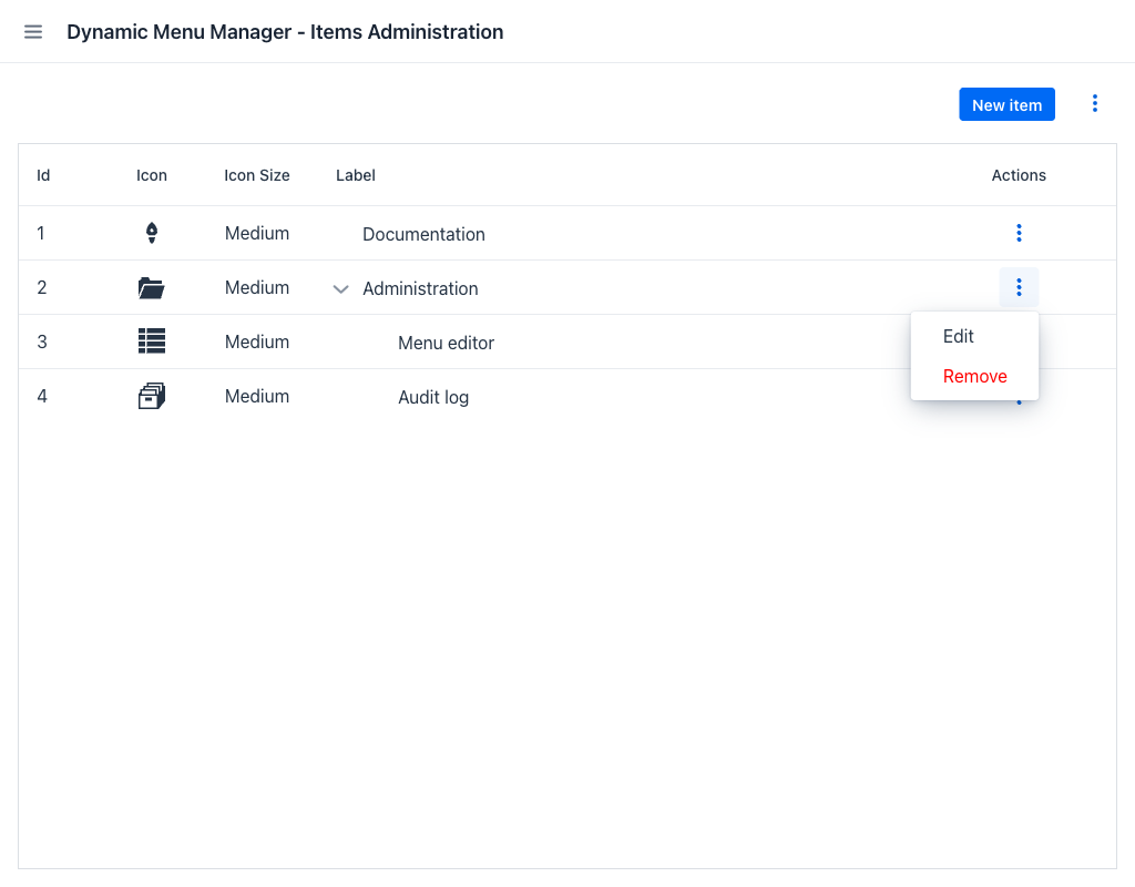
Each row in the grid has a ⋮ button that opens a contextual menu with the following options:
- Edit: Opens the item edition dialog pre-filled with the item's current values.
- Remove: Deletes the item after confirmation.
The confirmation dialog depends on whether the item has children. For an item without children it asks Are you sure you want to delete this item? and offers a single Delete button. For an item with children it asks The menu item has sub-items. Would you like to delete them too? and offers two options:
- Delete all: Deletes the item together with all its descendants.
- Delete parent: Deletes only the item. Its children are promoted one level up, to the position the deleted item occupied in the hierarchy, and are placed after the entries already at that level.
Warning
Item deletion is permanent and cannot be undone.
Item Creation / Edition
Creating or editing a menu item opens a dialog with two tabs: Item Settings and Permissions.
Item Settings Tab
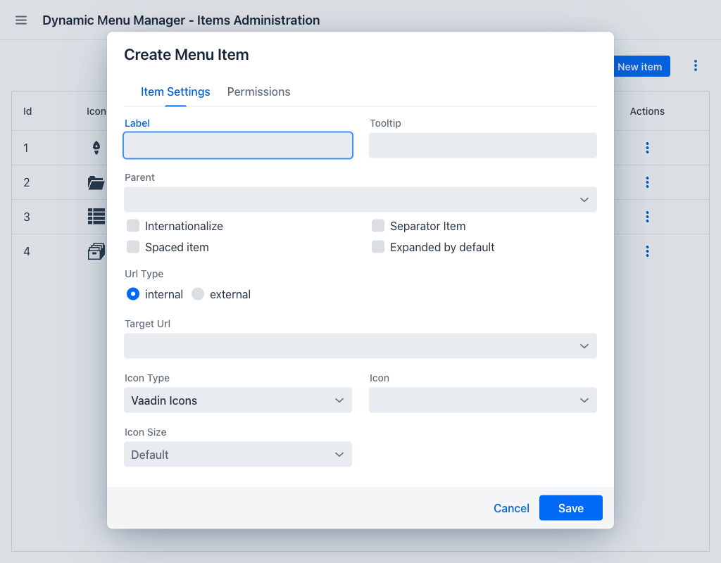
The Item Settings tab contains the main configuration for the menu item:
| Field | Description |
|---|---|
| Label | The display text for the item. Required unless the item is a separator. |
| Internationalize | When enabled, the Label and Tooltip fields accept i18n message keys instead of literal text, and are relabelled Label's key and Tooltip's key to reflect it. The translated value will be displayed in the menu at runtime. |
| Tooltip | Optional tooltip text shown on hover. |
| Parent | Optional. Assigns this item as a child of another item, nesting it in the menu hierarchy. The dropdown lists the candidate parents by label and identifier, and excludes the item itself and any item with an external URL. |
| Separator Item | When checked, the item renders as a visual separator instead of a clickable entry. A separator with a label acts as a section header; one without a label is a plain divider. Most other fields are disabled when this is active. |
| Spaced item | Adds extra spacing between the icon and the label. |
| Expanded by default | When checked, the item is expanded by default in the menu if it has children. |
| Url Type | Selects between Internal (a route within the application) and External (an arbitrary URL). |
| Target Url | The destination for the menu item. For internal URLs, a dropdown lists all registered application routes. For external URLs, a text field accepts any URL. If the selected internal route has required parameters, additional fields appear to specify their values. Depending on the route definition, these fields may be subject to format validations — such as pattern constraints on a URL parameter — which are enforced when the form is submitted. |
| Icon Type | Selects the icon family to pick the icon from. The families offered here are the ones the application makes available; by default only the Vaadin icon set is present. If the item uses a family that the application no longer offers, the field is left empty and shows the name of that family as a placeholder; saving then keeps the stored family and icon unless another family is picked. |
| Icon | A searchable dropdown listing the available icons for the selected icon family, each shown next to its name. |
| Icon Size | The size at which the icon is rendered in the menu: Small, Medium or Large. Leaving the field empty — the Default placeholder — makes the item follow the application-wide default size. |
Note
When an internal route is a route alias, the dropdown displays the alias template followed by (Alias of <main-route>) to indicate the relationship to the canonical route. For example: /alias-route (Alias of /main-route). The application's root path is listed as / (Root path).
Permissions Tab
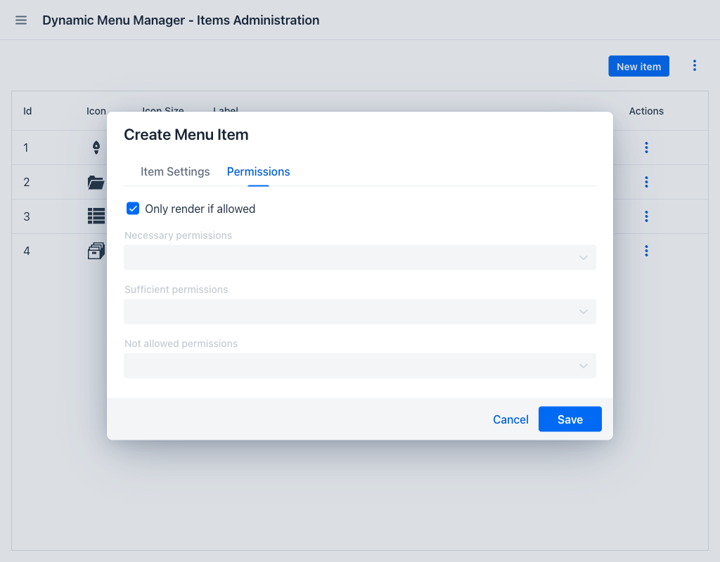
The Permissions tab controls who sees the menu item. Visibility can be decided in either of two ways, selected with the Only render if allowed checkbox at the top of the tab.
Following the application's access rules
Only render if allowed delegates the decision to the application itself: the item is shown only if the logged-in user is allowed to reach the view the item points at. Nothing has to be configured per item, and the menu cannot drift out of step with the access rules of the views it links to.
This option is checked by default for every new item. While it is checked, the three role fields below are disabled, because they are not consulted.
The option only has an effect on items that point at an internal route. An item with an external URL, a separator, or a group header that has no destination of its own is always rendered regardless of this setting.
Configuring roles explicitly
Clearing Only render if allowed enables the three role fields, and visibility is then decided by the roles of the logged-in user. Each field accepts one or more of the roles available in the application.
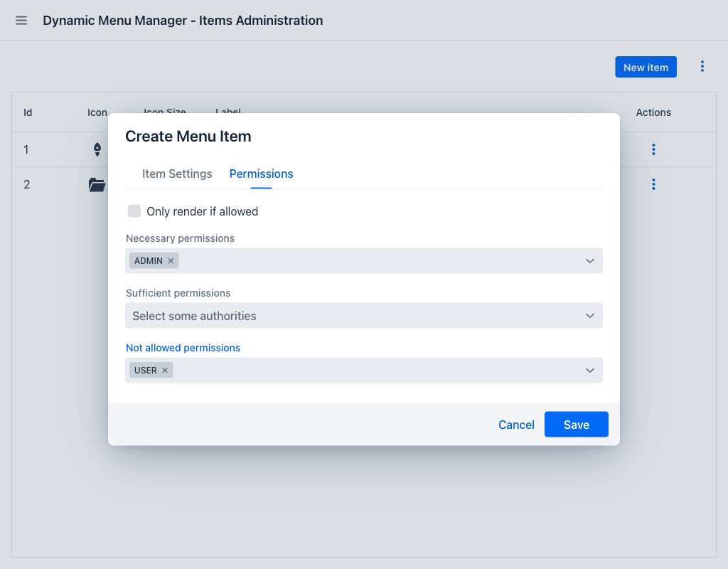
| Field | Condition to show the item |
|---|---|
| Necessary permissions | The user must have every role in this set. If even one is missing, the item is hidden. |
| Sufficient permissions | The user must have at least one role in this set. If the user has none of them, the item is hidden. |
| Not allowed permissions | The user must have none of the roles in this set. If the user has even one of them, the item is hidden. |
Each configured constraint must pass simultaneously for the item to be shown, and constraints with no roles selected are ignored. The three are evaluated in order — Not allowed is checked first, then Necessary, then Sufficient.
Examples:
- To restrict an item to a single role (e.g.
ROLE_ADMIN): add it to Necessary permissions. - To show an item to anyone who has at least one of several roles: add those roles to Sufficient permissions.
- To hide an item from users with a specific role (e.g. guests): add that role to Not allowed permissions.
- Combining fields is possible: for example, requiring
ROLE_MANAGERvia Necessary while also blockingROLE_READONLYvia Not allowed means only managers who are not read-only will see the item.
If Only render if allowed is cleared and no roles are configured on any of the three fields, the item is visible to every user.
Action Buttons
- Save (creation) / Update (edition): Validates and persists the form. On success, the dialog closes and the grid refreshes.
- Cancel: Discards all changes and closes the dialog.
Import
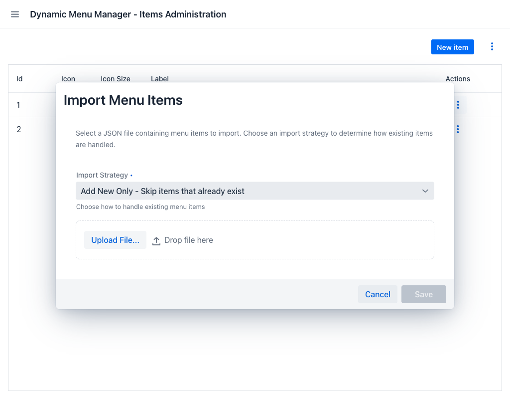
The import dialog allows loading a previously exported menu configuration from a JSON file. It consists of two steps:
1. Configure the Import
- Import Strategy: A required dropdown that determines how the imported items interact with the existing menu configuration. Add New Only is preselected when the dialog opens.
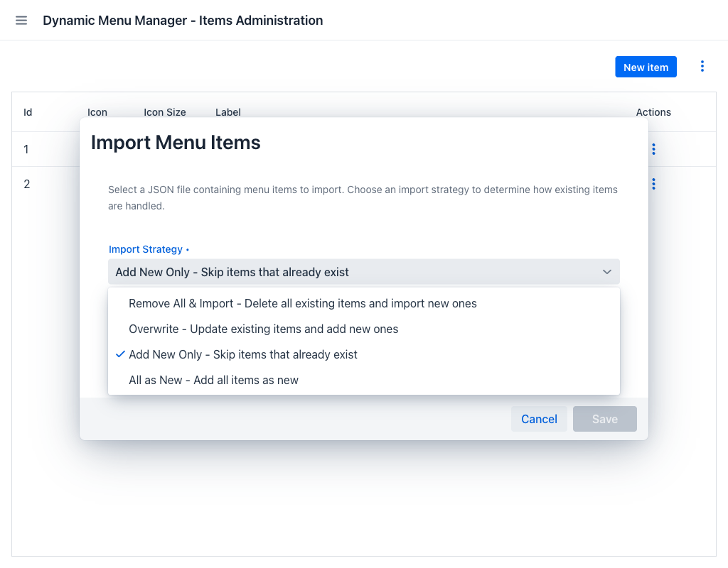
| Strategy | Behaviour |
|---|---|
| Remove All & Import | Deletes the entire existing menu configuration, then imports the items from the file. |
| Overwrite | Updates existing items with the imported data and creates the items that do not yet exist. |
| Add New Only | Skips items that already exist, matched by identifier. Only new items are created. |
| All as New | Ignores the identifiers in the file and adds every item as a new one, leaving the existing configuration untouched. |
- File upload: Upload a
.jsonfile exported from this appjar. Drag and drop is also supported. Once a file has been accepted the upload control is replaced by the preview described below.
2. Preview and Confirm
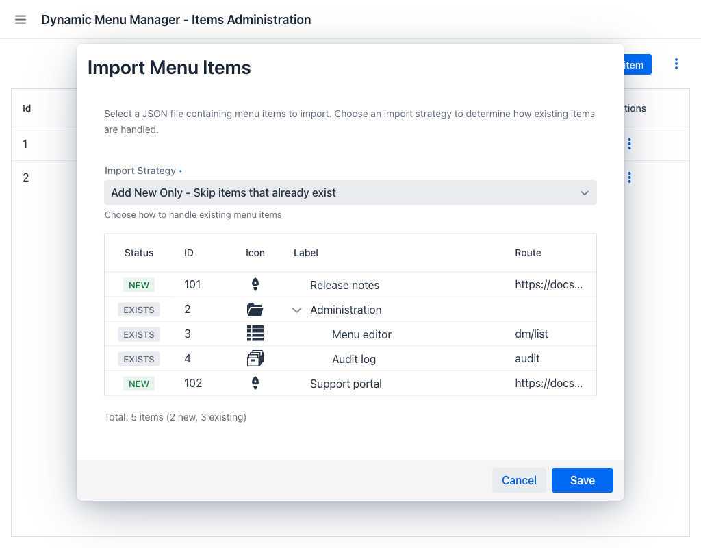
After a file is uploaded, a preview grid appears showing the items it contains, as the same tree they will form once imported. The grid has the following columns:
- Status: A badge marking how the item relates to the current configuration. NEW (green) means the item does not exist yet and will be created; EXISTS (grey) means an item with that identifier is already present, and what happens to it depends on the selected strategy.
- ID: The identifier carried in the file.
- Icon: A preview of the item's icon. An icon the application cannot resolve is dropped from the item rather than blocking the import.
- Label: The item's display text, nested to show the hierarchy.
- Route: The item's destination, whether internal or external.
A summary line below the grid shows the total number of items, how many are new, and how many already exist.
Click Save to execute the import. Click Cancel to abort.
Note
The Save button is only enabled once a file has been uploaded successfully. A file that cannot be parsed, or that contains an item with both an internal and an external URL or with no label, is rejected with an explanatory notification and nothing is imported.
Free Mode
When the application runs without a valid Dynamic Menu license, the view operates in free mode and a bar is displayed above the grid. It carries a Free version badge, whose information icon summarises the counting rule described below, an Upgrade badge linking to the licensing information, and a Menu items: counter showing how much of the free allowance is in use.
The allowance is five menu items, and only the items that lead to a destination of the application itself count towards it. The following items are not counted, however many there are:
- Separators, with or without a label.
- Items with no URL of their own, such as a group header that only holds children.
- Items whose internal URL opens a view provided by an AppJar, such as the Dynamic Menu view itself or a view of another AppJar installed in the application.
Every other item counts, including every item with an external URL.
The New item button and the Import action stay available whatever the count, so items that are not counted can always be added. The limit is applied in the item editor instead: its Save button is disabled whenever the item being composed would take the count past five, and this is checked again each time the Separator Item, Url Type or Target Url field changes. Beyond the allowance, the view also becomes read-only: drag and drop reordering, the Export and Refresh menu actions, and the Edit row action are all disabled.
The allowance also applies to the contents of an imported file, not only to the items already stored. The Save button of the import dialog stays disabled whenever importing the file with the selected Import Strategy would take the count past five. The projection follows the strategy: with Remove All & Import it starts from an empty menu, with Add New Only the items that already exist are left out, and with Overwrite an item that replaces an existing one is counted only once. Changing the strategy re-evaluates the button, so a file refused under one strategy may be accepted under another.