Report Designer
The Report Designer draws the printed layout of a query. A grid export is enough for a spreadsheet, but not for a document that has to look a particular way — with a title, page headers and footers, sections grouped by a column value, and fields placed at precise positions. The designer produces that layout, and the report view then exports a PDF rendered from it.
The layout is called a report template, and it is optional. A query without one keeps the standard grid export, and nothing about it changes.
The template never defines its own data. Its fields are the result columns of the query it belongs to, and its parameters are that query's parameters, so it is always filled with the rows the query returns for the parameter values and column filters the user entered. This is why the designer is reached from a query and not from a menu of its own.
Opening the Designer
The designer is opened from a saved query definition, in either of two places:
- The Design report action in the row menu of the Query Definitions view.
- The Design report button on the Report tab of the query definition form.
Both require the definition to have been saved first, because the designer works from the query's stored columns and parameters.
Each time the designer opens, it synchronises those columns and parameters into the design. A column added to the query after the layout was drawn is therefore available immediately, without any action in the designer. A column that was removed is not silently deleted from the layout: the element referring to it stays where it is and is reported as an unresolved reference when the design is saved, so the omission is visible rather than hidden.
The Designer
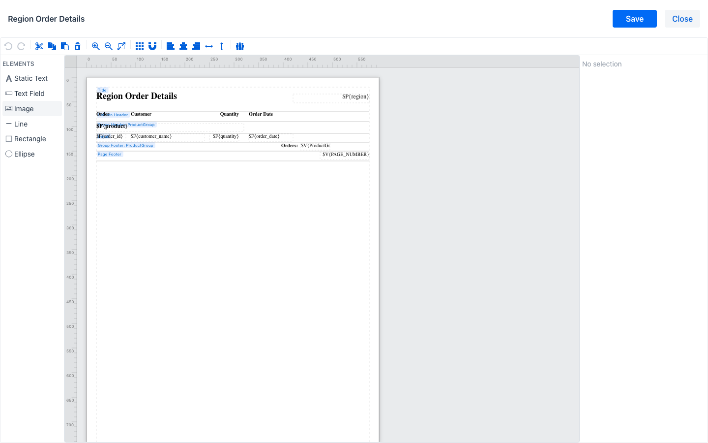
The screen has four areas: a top bar with the name of the query and the Save and Close buttons, a toolbar, the element palette on the left, the canvas in the middle, and the properties panel on the right.
Note
The designer is a desktop tool. On a phone-sized screen the canvas is replaced by a message explaining that a larger screen is required.
Bands
The canvas is divided horizontally into bands, each labelled at its top left corner. A band is a region of the page with a rule about when it prints, and every element belongs to the band it sits in:
- Title: printed once, at the beginning of the report.
- Page Header: printed at the top of every page.
- Column Header: printed at the top of every column.
- Detail: printed once for every row the query returns. This is the band that produces the body of the report.
- Column Footer: printed at the bottom of every column.
- Page Footer: printed at the bottom of every page.
- Summary: printed once, at the end of the report.
- Group Header and Group Footer: printed at the beginning and the end of each group, when groups are configured. Each group contributes its own pair.
The height of a band is changed by dragging its lower boundary. A band with no height does not print.
Palette
The palette on the left lists the elements that can be placed on the canvas. Each is added by dragging it onto a band:
- Static Text: a fixed text, such as a heading or a column caption.
- Text Field: a value worked out when the report is filled. This is how a result column reaches the page, written as an expression such as
$F{order_id}, and how a parameter does, written$P{region}. - Image: a picture, such as a logo.
- Line, Rectangle and Ellipse: rules, boxes and shapes used to structure the page.
Toolbar
The toolbar groups the editing actions. From left to right:
- Undo and Redo reverse and reapply the last change, also available as
Ctrl+ZandCtrl+Y. - Cut, Copy, Paste and Delete operate on the current selection, also available as
Ctrl+X,Ctrl+C,Ctrl+VandDel. - Zoom in, Zoom out and Fit to viewport change the magnification of the canvas.
- Toggle grid shows or hides the alignment grid, and Toggle snap to grid controls whether elements snap to it while being moved.
- Align left, Align center and Align right, together with Distribute horizontally and Distribute vertically, arrange several selected elements relative to each other.
- Manage report groups opens the groups dialog described below.
Properties Panel
Selecting an element on the canvas fills the properties panel on the right with its settings, grouped into collapsible sections. With nothing selected the panel reads No selection; with several elements selected it reports how many.
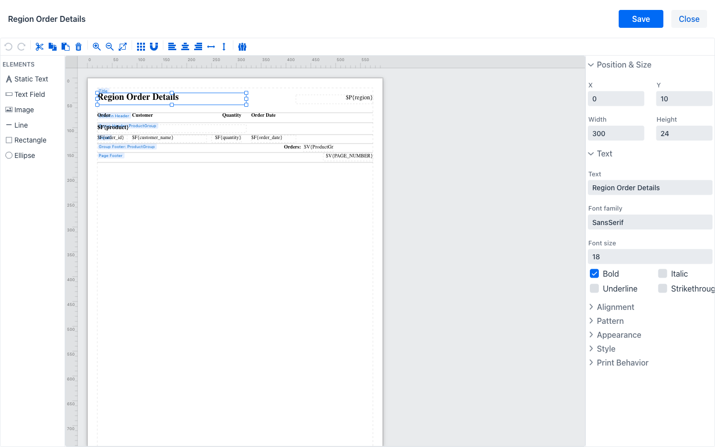
Which sections appear depends on the kind of element. The common ones are:
- Position & Size: the X and Y coordinates of the element within its band, and its Width and Height.
- Text: for a static text, the Text itself; for a text field, the Expression that produces the value. Both carry the Font family, Font size and the Bold, Italic, Underline and Strikethrough settings.
- Alignment: the Horizontal and Vertical alignment of the text inside the element's box.
- Pattern: the Format pattern applied to a value, for example a date or currency pattern.
- Image: for an image, its source, Scale and Lazy loading.
- Line and Border: the width, style and colour of a rule or of the border of a box.
- Appearance and Style: colours and the named style the element uses.
- Print Behavior: the rules governing when the element prints, such as whether it is suppressed when its value repeats.
Referring to Columns and Parameters
An element shows data by referring to a field or a parameter in its expression:
$F{columnKey}is the value of a result column for the row currently being printed. It belongs in the Detail band, or in a group band where it takes the value that begins the group.$P{parameterKey}is a parameter value the user entered. It is the same for every row, so it belongs in the Title or a header band — a report of one region typically states that region in its title.$V{...}is a value the reporting engine maintains, such as$V{PAGE_NUMBER}for the current page, or the row count of a group.
The field and parameter keys available are exactly the result column keys and parameter keys of the query, which is what the synchronisation on opening guarantees.
Report Groups
A group partitions the detail rows by the value of a column and contributes a header and a footer band around each partition — one section per product, per region, per month, with its own heading and its own totals.
Manage report groups in the toolbar opens the dialog.
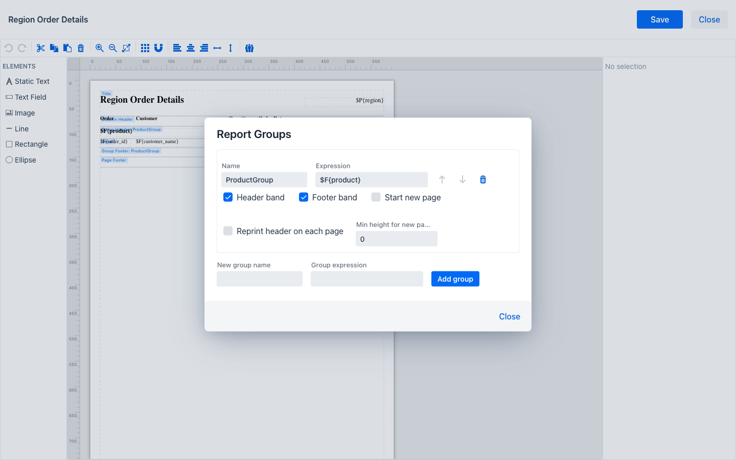
Each existing group is shown as a block with its settings:
- Name: the name of the group. It is what the group's bands are labelled with on the canvas, and what the engine's group values are named after.
- Expression: the value the rows are partitioned by, normally a field reference such as
$F{product}. - Header band and Footer band: whether the group contributes those bands. Enabling one makes it appear on the canvas, ready for elements.
- Start new page: whether each group begins on a fresh page.
- Reprint header on each page: whether the group's header is repeated at the top of each page a long group spans.
- Min height for new page: the space that must remain on the page for a group to start on it rather than on the next.
The arrows beside a group move it in the nesting order, outermost first, and the bin icon removes it. Below the existing groups, New group name and Group expression with Add group create another.
Note
A grouped report needs its rows to arrive in group order, because groups are detected by a change of value between consecutive rows rather than by sorting. When a group's expression is a plain field reference such as $F{product}, the rows are sorted by that column automatically before the report is filled. For any other expression, producing rows in the right order is the author's responsibility, normally with an ORDER BY in the query body.
Saving
Save in the top bar checks the design first. If it finds problems — a reference to a field or parameter that does not exist, an element extending beyond the bounds of its band, two groups sharing a name — it lists them in a dialog. From there the design can be corrected, or saved anyway: the stored document is still valid, and an unresolved reference surfaces as an error when a user tries to export.
Leaving the designer with unsaved changes asks for confirmation. Close returns to the query definition.
A saved layout does not take effect on its own. It is used for exports only while Use the report for exports is ticked on the Report tab of the query definition, which is also where a layout is deleted.
What the User Sees
Once a query has an enabled layout, its report view no longer shows the grid export buttons. It shows a single Export PDF button instead, which becomes available after the query has been run and produces the designed document filled with the rows on screen — same parameter values, same column filters, all rows rather than the visible page. The grid and any chart the query has are unaffected.
Note
Exports from a designed layout are produced as PDF. Other formats remain available through the standard grid export, which applies whenever no layout is enabled.