Dashboards
A dashboard arranges several query definitions on a single page. Each panel, called a widget, points at one query and renders it as a grid or a chart. A dashboard is published at its own address, so it can be bookmarked or added to the application's navigation.
The difference between a dashboard and a report view is where the parameter values come from. A report view asks the user; a dashboard supplies them itself, either as values the administrator fixed or as values worked out when the page opens. A dashboard therefore shows its data straight away, with nothing to fill in.
A dashboard does not own its queries. It references them, so a query that a dashboard shows can equally be opened as a report of its own, and editing the query changes both.
Dashboards Listing
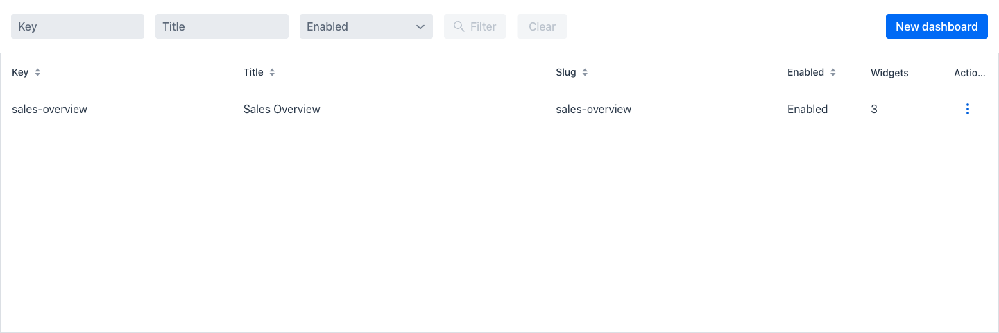
Entering the view shows a listing of every dashboard, with a filter area above the grid.
Filters
The filter area offers three fields. The Filter button becomes active as soon as any field has a value, and Clear resets them.
- Key: When entering a text in this field, only the dashboards whose key contains the entered text are shown.
- Title: When entering a text in this field, only the dashboards whose title contains the entered text are shown.
- Enabled: A dropdown restricting the grid to enabled or to disabled dashboards.
At the right of the filter area, the New dashboard button opens an empty dashboard editor.
Dashboards grid
- Key: The unique internal identifier of the dashboard.
- Title: The user-facing heading of the dashboard. For an internationalised dashboard, this column shows the translated text.
- Slug: The address segment the dashboard is served from.
- Enabled: Whether the dashboard can be opened. A disabled dashboard is not reachable at its address.
- Widgets: The number of widgets currently on the dashboard.
- Actions: A dropdown menu of the actions that can be performed on the dashboard of the current row.
Actions
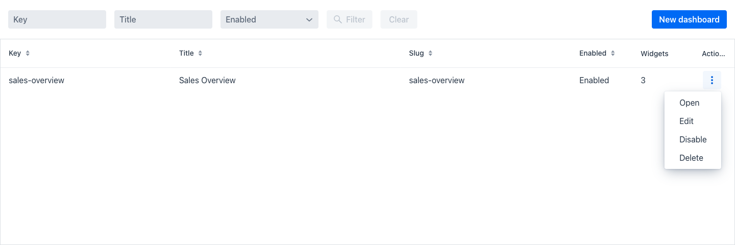
- Open: Opens the dashboard as a user sees it, at its own address.
- Edit: Opens the dashboard editor described below.
- Disable / Enable: Toggles whether the dashboard is reachable, without deleting it.
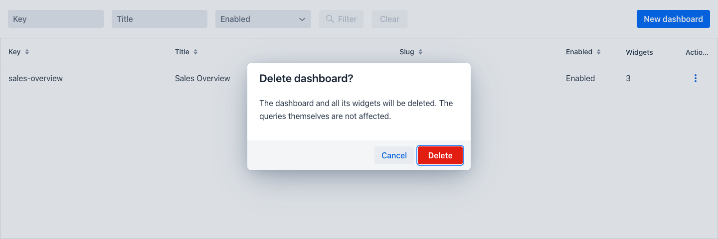
- Delete: Displays a confirmation dialog asking to confirm the deletion.
Warning
Deleting a dashboard also deletes its widgets and their configured parameter values, and cannot be undone. The query definitions the widgets pointed at are not affected.
Dashboard Edition
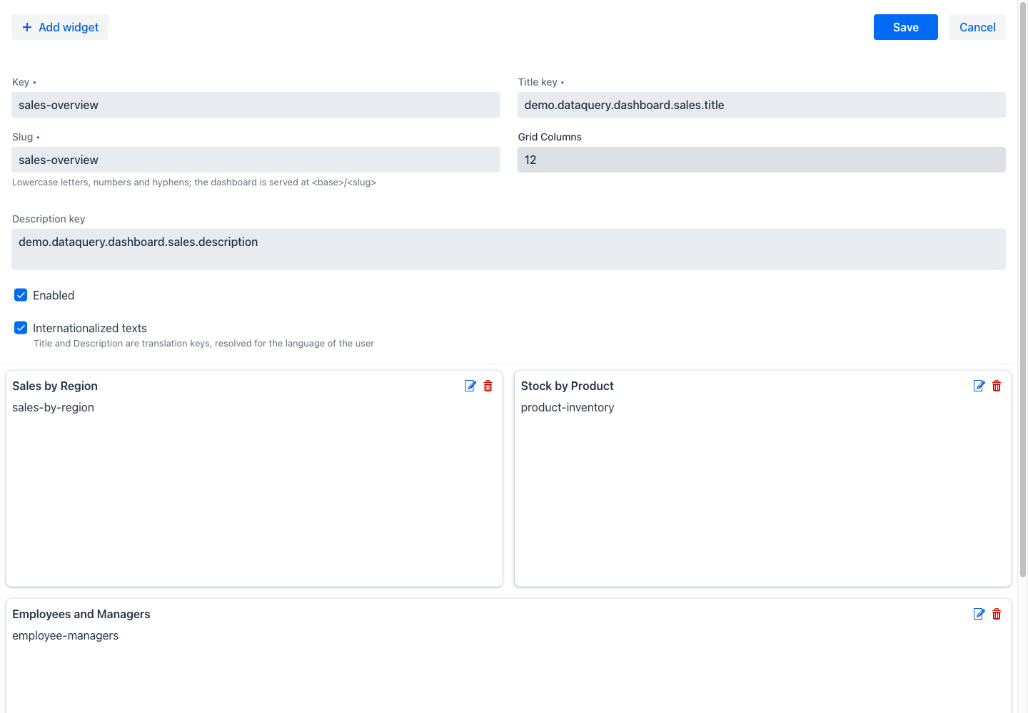
The dashboard editor is a metadata form above the widget layout. The Save button persists the dashboard, its widgets and their positions together; Cancel discards the changes, asking for confirmation if any were made.
Dashboard fields
- Key: The unique internal identifier of the dashboard. Required.
- Title: The heading shown at the top of the dashboard. Required.
- Slug: The address segment the dashboard is served from — the dashboard is reachable at the configured dashboard base route followed by this value. Required, unique, and restricted to lowercase letters, numbers and hyphens, as the helper text states.
- Grid Columns: The number of columns the widget layout is divided into. Widget widths are expressed in these columns.
- Description: Optional text shown below the title.
- Enabled: Whether the dashboard is reachable at its address.
- Internationalized texts: When ticked, the title and the description are no longer literal text but translation keys, resolved for the language of each user, along with the title overrides of the widgets. Ticking it relabels the governed fields to end in "key".
Arranging the widgets
Below the form, the widgets are shown on the layout grid as they will appear to a user. Each can be dragged to a new position and resized by its edges, and the arrangement is stored when the dashboard is saved. Every widget card carries two icons: a pencil that opens its configuration, and a bin that removes it from the dashboard.
Add widget at the top left opens the same configuration dialog for a new widget.
Widget Configuration
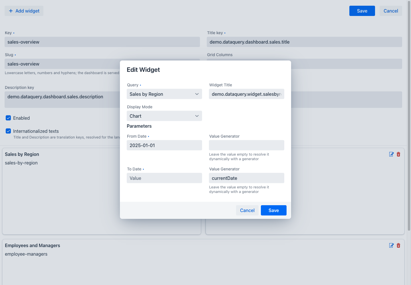
- Query: A dropdown of the enabled query definitions. This is the query the widget renders. Required.
- Widget Title: An optional heading for the widget. Left empty, the widget falls back to the display name of its query — which for an internationalised query is resolved under that query's own setting, so a dashboard of translated widgets may need no widget text at all.
- Display Mode: Auto uses whatever the query itself is configured to show, which is its chart when it has one and its grid otherwise. Table forces the grid, and Chart forces the chart. Choosing Chart for a query that has no chart configured is rejected when the dashboard is saved.
Parameters
Below these, the dialog lists one entry per parameter the selected query declares, because a widget has no parameter form of its own and must supply every value the query needs. Each parameter offers two ways to do so:
- A value field, holding a fixed value used on every visit.
- A Value Generator field, naming a generator that works out the value when the dashboard opens. As the helper text notes, leaving the value empty is what makes the generator apply. The built-in generators are
currentDate,currentDateTime,currentUser, andquery:<queryKey>:<columnKey>.
Combining the two across the parameters of one query is normal: a widget showing a period that begins on a fixed date and ends today takes a fixed value for the start and the currentDate generator for the end.
A widget whose required parameters are not all satisfied is not rejected. It renders a notice in place of its data, so one incomplete widget does not prevent the rest of the dashboard from working.
Without a Licence
Without a licence the appjar allows one dashboard, and five queries a user can open. A bar above the grid in the dashboards listing shows a Dashboards and a Queries counter against those limits, alongside a note naming the limited version.
Once a dashboard exists, the New dashboard button is disabled and explains the limit in its tooltip. Exceeding either limit restricts the view further: Open, Edit and Disable are disabled in every row menu, leaving Delete as the only action, until enough dashboards or queries have been removed for the counts to fit again. See Licensing.